
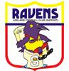
Pretty sure there's a wolf on the Bloods' logo because West briefly adopted the 'Wolves' moniker in 1970s.
Or is my mind playing tricks on me?
New Club Logos
34 posts
• Page 2 of 2 • 1, 2
![]() by Magpiespower » Sat Apr 08, 2006 5:24 pm
by Magpiespower » Sat Apr 08, 2006 5:24 pm
-
Magpiespower - Coach
-


- Posts: 6292
- Joined: Thu Oct 27, 2005 9:12 am
- Location: Salisbury
- Has liked: 0 time
- Been liked: 125 times
- Grassroots Team: Salisbury
![]() by Punk Rooster » Sat Apr 08, 2006 7:55 pm
by Punk Rooster » Sat Apr 08, 2006 7:55 pm
Using this logic, there's a problem with Glenelg being called The Bays & Tigers?wide receiver wrote:Adelaide Hawk wrote:wide receiver wrote:Magpiespower wrote:None of the old logo's are 'broke' as such.
I don't know if you ever noticed this, but the Bloods' logo has a wolf in it.
A bloodhound is not a wolf.
It's been 'broke' for 30 years!
The Bloods isn't short for Bloodhounds, it's from "Blood 'n' Tars', blood for the red colour and tar for the black.
Then why is the club pushing the blood hound on its home page?
Think about this from the perspective of the general public. They're getting a confused message of what the club identity is. They're told it's the bloods, with a wolf and a bloodhound, when it's actually the blood and tars - but the club isn't marketed as the blood and tars, so they can't be expected to know that. They just see two different animals and think "huh?"
We need to pick one thing and stick with it.
Ralph Wiggum wrote:That's where I saw the leprechaun. He told me to burn things
Ken Farmer>John Coleman
Hindmarsh Pest Control
-

Punk Rooster - Coach
-


- Posts: 11948
- Joined: Thu Oct 27, 2005 9:30 am
- Location: Paper Street Soap Company
- Has liked: 16 times
- Been liked: 16 times
- Grassroots Team: Fitzroy
![]() by Strawb » Sun Apr 09, 2006 1:04 pm
by Strawb » Sun Apr 09, 2006 1:04 pm
In the 70's Westies where called the wolves but good ol' Knuckles changed us back to the bloods and the logo changed i dunno when R&B might be able to fill in the blanks. I have seen some old westies badges with a bloodhound on it. I know when Mordialloc where in the VFA they had a bloodhound for a logo and it looked a little silly and mind you Mordialloc's colours are red and white.
I am the Voice Left From Drinking


![]() by Barto » Sun Apr 09, 2006 4:02 pm
by Barto » Sun Apr 09, 2006 4:02 pm
I used to be of the same opinion re a template but if you look at the top of the AFL site, all the different logos look pretty good. If they're well designed, I cant see a problem.


![]() by eaglehaslanded » Fri Apr 14, 2006 12:54 pm
by eaglehaslanded » Fri Apr 14, 2006 12:54 pm
If any club in the SANFL needs to change it's logo it would be the Eagles. It would be interesting to see what they would come up with. Somewhere between the West Coast Eagles new logo and the Philadelphia Eags from the NFL would be good. An Eagle is awe inspiring bird and deserves to be seen that fashion. A new logo in my opinion would have to strike fear in it's opponents, maybe even something like the Eagle on the Torrens jumper of old.
"We're the mighty Eagles"
-
eaglehaslanded - League - Best 21
-


- Posts: 2355
- Joined: Fri Dec 23, 2005 6:06 pm
- Location: Melbourne "the sporting capital of Australia"
- Has liked: 0 time
- Been liked: 15 times
- Grassroots Team: Central United
![]() by Punk Rooster » Fri Apr 14, 2006 3:14 pm
by Punk Rooster » Fri Apr 14, 2006 3:14 pm
& also get rid of that crappy jumper that look like the players vomited all over it on a mad monday.
Ralph Wiggum wrote:That's where I saw the leprechaun. He told me to burn things
Ken Farmer>John Coleman
Hindmarsh Pest Control
-
Punk Rooster - Coach
-
- Posts: 11948
- Joined: Thu Oct 27, 2005 9:30 am
- Location: Paper Street Soap Company
- Has liked: 16 times
- Been liked: 16 times
- Grassroots Team: Fitzroy
![]() by eaglehaslanded » Fri Apr 14, 2006 9:00 pm
by eaglehaslanded » Fri Apr 14, 2006 9:00 pm
Punk Rooster wrote:& also get rid of that crappy jumper that look like the players vomited all over it on a mad monday.
Actually Punky I would have to say we have the best guernsey design of any sanfl club. By far the most creative and imaginative. Most other clubs should follow our lead and start gettin more creative instead of sticking to their plain, boring old jumpers.
"We're the mighty Eagles"
-
eaglehaslanded - League - Best 21
-
- Posts: 2355
- Joined: Fri Dec 23, 2005 6:06 pm
- Location: Melbourne "the sporting capital of Australia"
- Has liked: 0 time
- Been liked: 15 times
- Grassroots Team: Central United
![]() by zipzap » Fri Apr 14, 2006 11:46 pm
by zipzap » Fri Apr 14, 2006 11:46 pm
eaglehaslanded wrote:Punk Rooster wrote:& also get rid of that crappy jumper that look like the players vomited all over it on a mad monday.
Actually Punky I would have to say we have the best guernsey design of any sanfl club. By far the most creative and imaginative. Most other clubs should follow our lead and start gettin more creative instead of sticking to their plain, boring old jumpers.
LOL
"A no vote from any club means there is some sort of risk involved in our entry into the competition not working," Steven Trigg.

![]() by eaglehaslanded » Sat Apr 15, 2006 10:09 am
by eaglehaslanded » Sat Apr 15, 2006 10:09 am
zipzap wrote:eaglehaslanded wrote:Punk Rooster wrote:& also get rid of that crappy jumper that look like the players vomited all over it on a mad monday.
Actually Punky I would have to say we have the best guernsey design of any sanfl club. By far the most creative and imaginative. Most other clubs should follow our lead and start gettin more creative instead of sticking to their plain, boring old jumpers.
LOL
You can laugh all you want my friend. But it's true it's damn true. The Eagles definately have the most original and imaginative design. I stand by my original comments and challenge anyone to let me know who's is better.
"We're the mighty Eagles"
-
eaglehaslanded - League - Best 21
-
- Posts: 2355
- Joined: Fri Dec 23, 2005 6:06 pm
- Location: Melbourne "the sporting capital of Australia"
- Has liked: 0 time
- Been liked: 15 times
- Grassroots Team: Central United
![]() by Dissident » Sat Apr 15, 2006 12:50 pm
by Dissident » Sat Apr 15, 2006 12:50 pm
Adelaide Hawk wrote:wide receiver wrote:Then why is the club pushing the blood hound on its home page?
I have no idea. I'm not a Westies supporter but I've never heard them referred to as the Bloodhounds.
Growing up, my Dad used to tell me that the Bloods were short for "Bloodhounds" - though that was during the early 80's. But, my Dad had always thought that growing up!

![]() by Dissident » Sat Apr 15, 2006 12:51 pm
by Dissident » Sat Apr 15, 2006 12:51 pm
Also - the wolf logo on the site - I remember that from when Iwas young - and I think in my youth-mind it was a dog - therefore a "hound" - but I knew SFA at that age!
(some would argue I still know SFA)
(some would argue I still know SFA)
![]() by Ian » Sat Apr 15, 2006 1:08 pm
by Ian » Sat Apr 15, 2006 1:08 pm
eaglehaslanded wrote:
You can feel sorry for us all you want my friend. But it's true it's damn true. The Eagles definately have the most disgusting design. I stand by my original comments and challenge anyone to let me know who's is uglier.
Can't argue with that

![]() by Leaping Lindner » Sat Apr 15, 2006 1:17 pm
by Leaping Lindner » Sat Apr 15, 2006 1:17 pm
I remember West being known as the Wolves in 1979 and 1980 and then Kerley changed back to the Bloods when he took over again in 1981.
The Footy Times Yearbook backs this up....
From 1980 (79 season)

From 1981 (80 season)

I also remember as a kid (late 60's/early 70's) they were known as the Blood and Tars and then when the SANFL introduced "official" logos in 1975 they were known simply as the bloods (short for bloodhounds).
The Footy Times Yearbook backs this up....
From 1980 (79 season)
From 1981 (80 season)
I also remember as a kid (late 60's/early 70's) they were known as the Blood and Tars and then when the SANFL introduced "official" logos in 1975 they were known simply as the bloods (short for bloodhounds).
"They got Burton suits, ha, you think it's funny,turning rebellion into money"
-
Leaping Lindner - Assistant Coach
-
- Posts: 4325
- Joined: Thu Oct 27, 2005 12:02 pm
- Location: Victoria
- Has liked: 17 times
- Been liked: 48 times
![]() by Leaping Lindner » Sat Apr 15, 2006 1:18 pm
by Leaping Lindner » Sat Apr 15, 2006 1:18 pm
Ian wrote:eaglehaslanded wrote:
You can feel sorry for us all you want my friend. But it's true it's damn true. The Eagles definately have the most disgusting design. I stand by my original comments and challenge anyone to let me know who's is uglier.
Can't argue with that
"They got Burton suits, ha, you think it's funny,turning rebellion into money"
-
Leaping Lindner - Assistant Coach
-
- Posts: 4325
- Joined: Thu Oct 27, 2005 12:02 pm
- Location: Victoria
- Has liked: 17 times
- Been liked: 48 times
34 posts
• Page 2 of 2 • 1, 2
Who is online
Users browsing this forum: No registered users and 77 guests
Advertisements by Advertisement Management