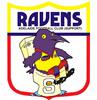
While I think Norwood's, South's and Central's new logos look great and are a small step in helping promote the game at a younger audience we think that although clubs should be well within their rights to change a logo that they should keep it in some sort of template.
Previously the 9/10 clubs all had round logos so it looked quite neat in publications or on websites when all the clubs logos were lined up.
Now with various shapes and sizes its going to look quite amateurish when they're all together.
You only have to look at the SAFooty logo at the top of the page to see how good it looks when all the club logos are the same dimensions.
It'd look a bloody mess if we put the new Dogs, Norwood and South logos in there!
And as an aside, good luck to the North Adelaide Roosters tomorrow against the Carolina Panthers!